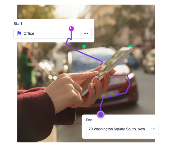
Revving up the digital identity of a vehicle reimbursement solution.


About the Project
Cardata, a mileage reimbursement software provider, wanted a new website that presented them as a modern tech brand. We partnered with them to revitalize their entire digital identity while preserving the brand’s defining elements.

Our Team
Meet the people who freed mobile workers from miles of reimbursement receipts.
Amaia Del Olmo
Frontend Lead

María Dieste
Associate Director of Client Operations

Maz Farah
Digital Strategist

Nat Kelner
Senior Director of Digital

Mercedes Lorenzo
Creative Director

Eli Pérez
Backend Developer

Isabel Teixeira
Client Operations Lead


Cardata’s Brand Tune-up
When a “check engine” light pops up on the dashboard, you know immediately that something is wrong with your car. Usually, it takes a mechanic (marketing mechanics, if you will) to find out which components are underperforming and either repair or replace them. Our audit of Cardata’s website concluded that, while we would need to optimize the structure and reimagine sections of content, capturing the mature, modern tech company feeling Cardata’s leadership wanted would require fine-tuning the brand’s existing visual identity. So that's exactly what we did.


UX + Graphic Design
While our web team built the new site using cutting-edge headless development frameworks, UX and graphic designers refined Cardata’s brand guidelines (preserving their existing palette of glowing purples and blues) to ensure the site met accessibility requirements without losing the brand’s innovative, semi-futuristic feel. At the end of the project, Cardata’s new, hyper-responsive site was outfitted with a mix of light- and dark-scheme pages, custom iconography, and a refreshed playbook for its visual identity that placed their brand among the Silicon Valley tech elites.

58%
increase in site traffic
42%
increase in average time on page


More Work by Terra
We’re looking forward to working with you, too.
Start conquering the digital terrain today.


